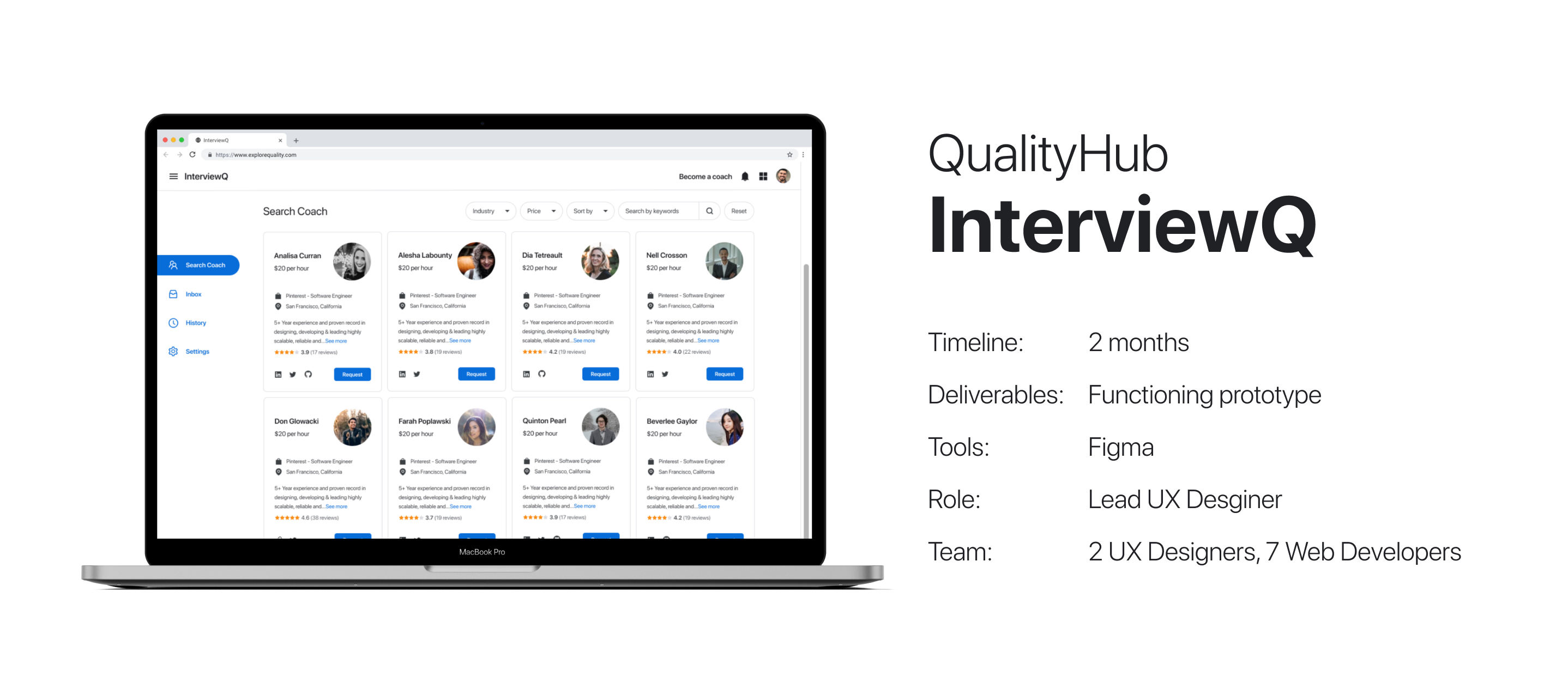
What is InterviewQ?
It’s mock interviews made easy and accessible. Job seekers (“seekers”) can find the right experienced professionals (“coaches”) that have experience in their field and schedule mock interviews with them.
Getting to know the users
Before creating wireframes, I first needed to better understand who InterviewQ’s users would be. There are two main personas for InterviewQ: seekers and coaches. I interviewed 3 potential seekers who had been job hunting recently and 2 potential coaches who were already experienced professionals in their field.
Conducting user interviews
During user interviews, I got a better understanding of the pain points of the job search process for both personas. In this case study, I will focus on the seeker persona.
The result of these user interviews was 2 main insights:
- The product must provide an easy way for seekers to find the best coach for them
- The product must give seekers confidence that they will get a good return on their investment
A brief look at competitors
Now I had a better understanding of seekers, but I wanted to go deeper and get firsthand experience of how competing services provide for the needs of seekers. I created accounts on a couple and the diagram below shows what they do well and what is lacking.
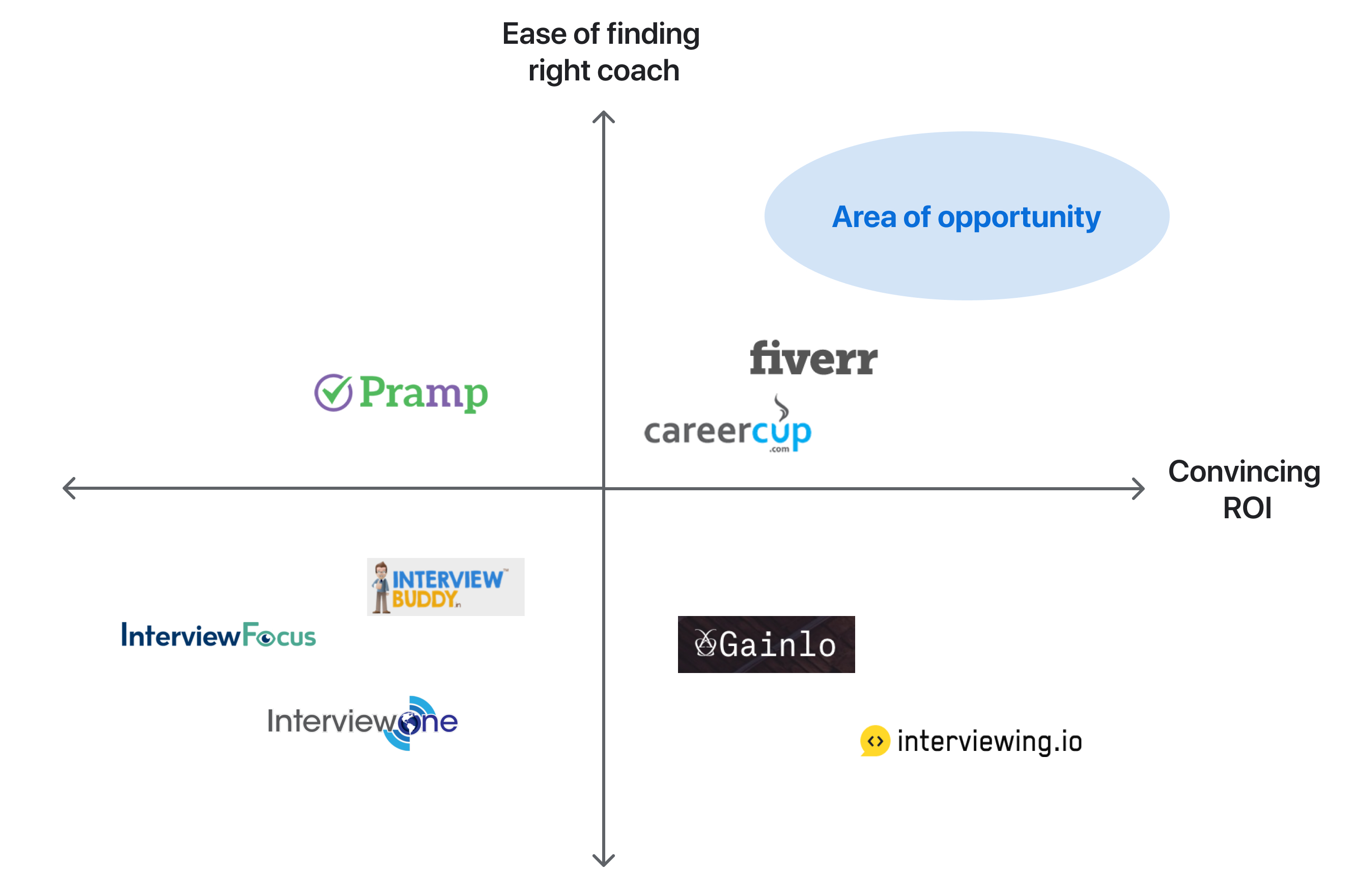
Visualizing market opportunity
Our challenge
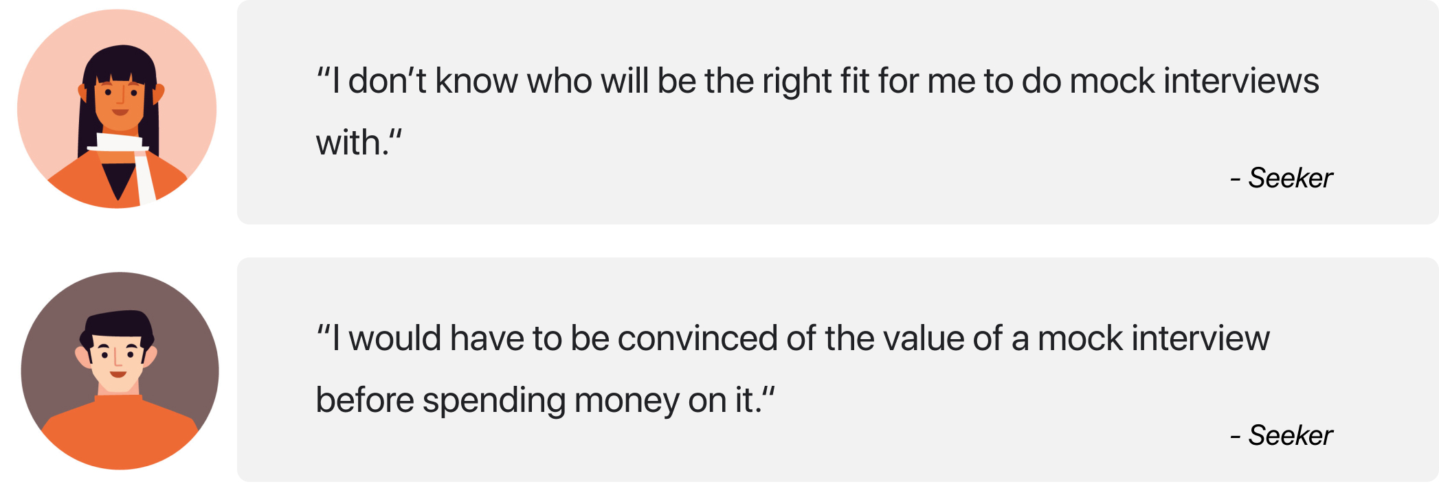
“Which coach is the right fit for me? Will I really get my money’s worth?”
If seekers can’t overcome these hurdles, the process stops before it even begins because seekers don’t book appointments with any coaches. There are lots of great coaches out there ready to mentor seekers. Our challenge to is connect seekers with the right coaches and provide convincing evidence of the value the coaches can deliver.
How might we empower seekers to find the right coach?
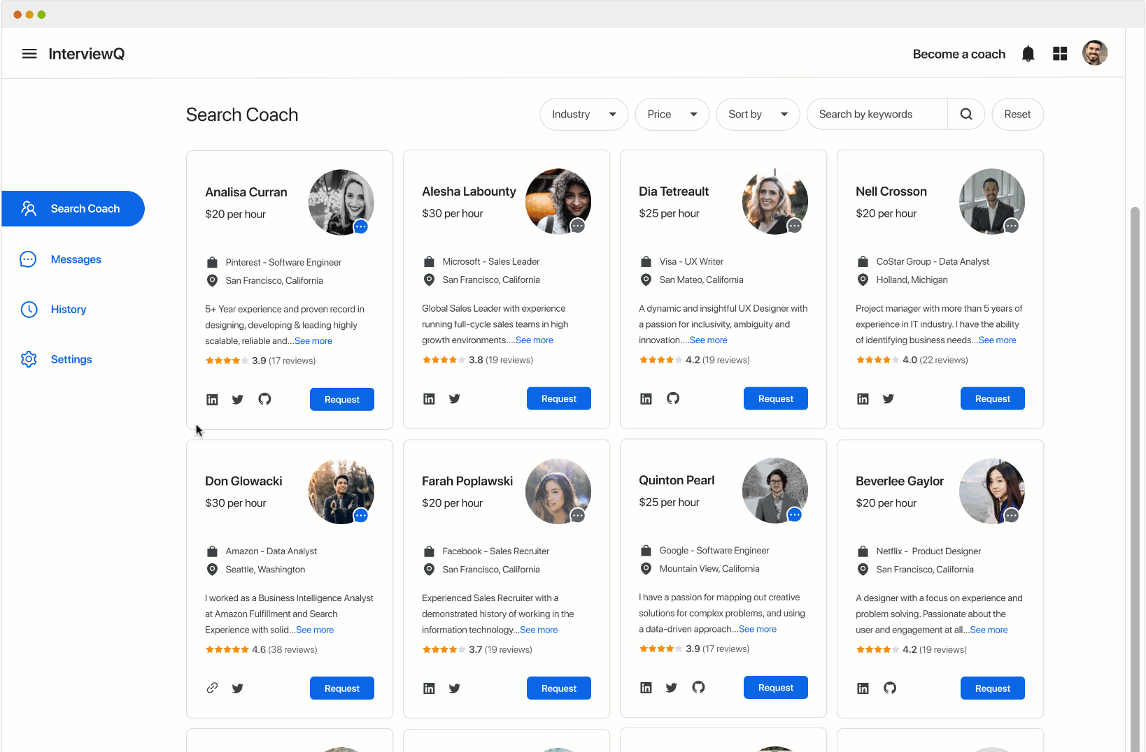
After signing in, the first thing most InterviewQ users do is search for a coach. There are coaches from many different fields, so filter functionality is important.
Sketches
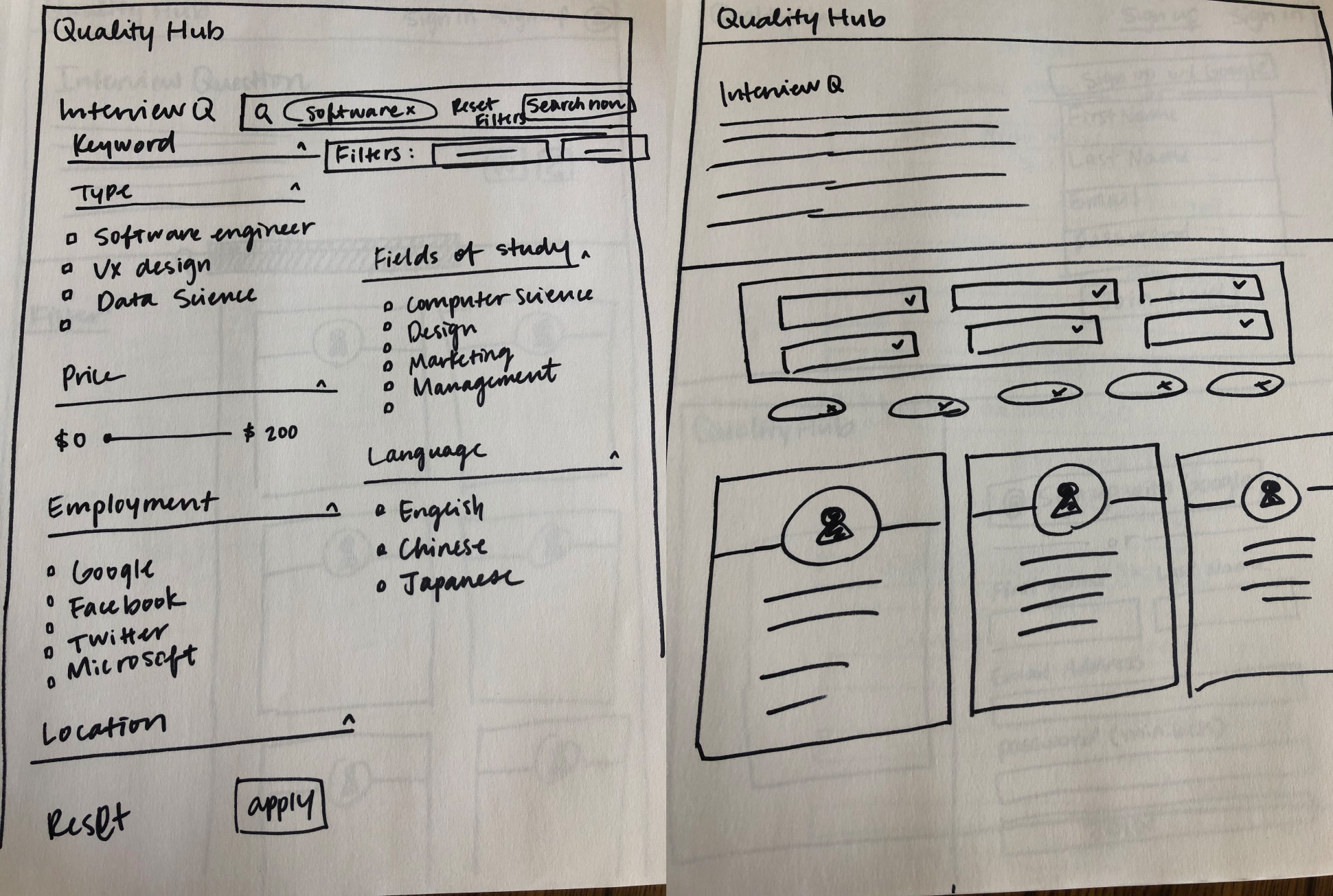
Sketching out some filter functionality
Wireframes version 1
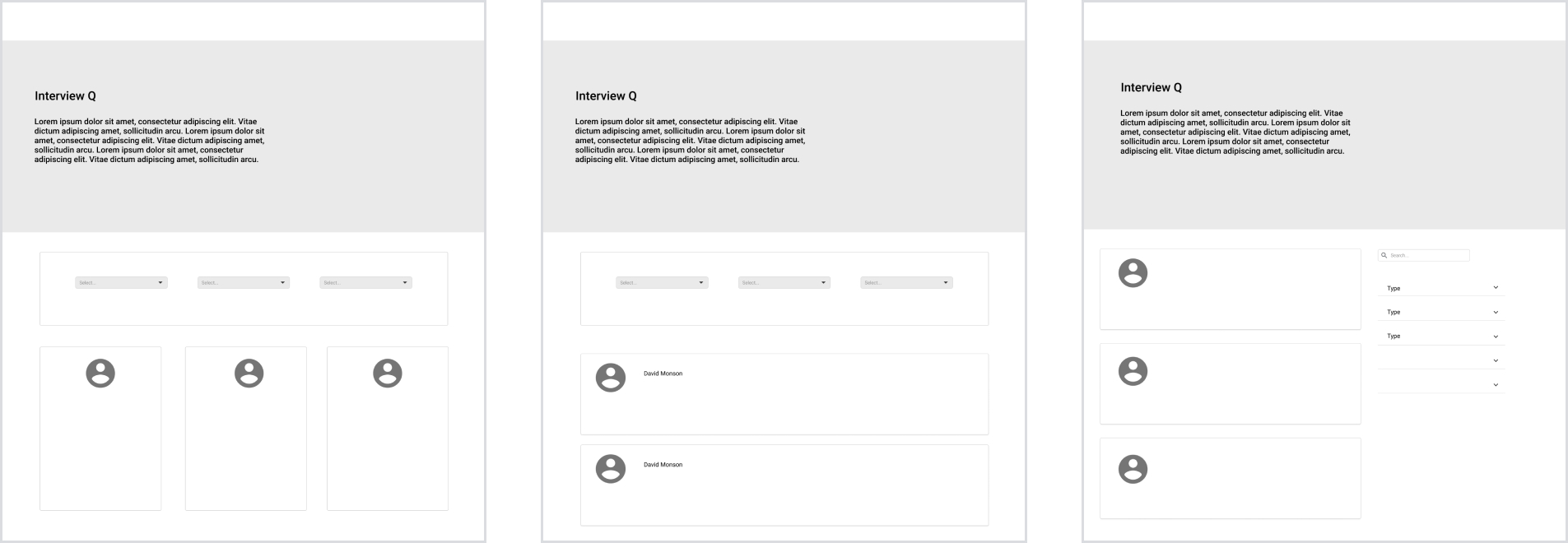
Early iteration
Based on usability test results, I decided to move forward with placing the search function at the top of the page. Version 2a below is the first mid-fidelity iteration that I created.
Version 2a: Filter hidden by default
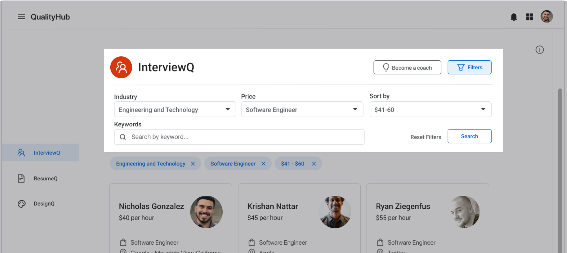
Version 2b: Filter showing by default
I did an A/B test (version 2a vs version 2b above) to find out if users prefer seeing the filter functions by default or not.
Feedback from the users
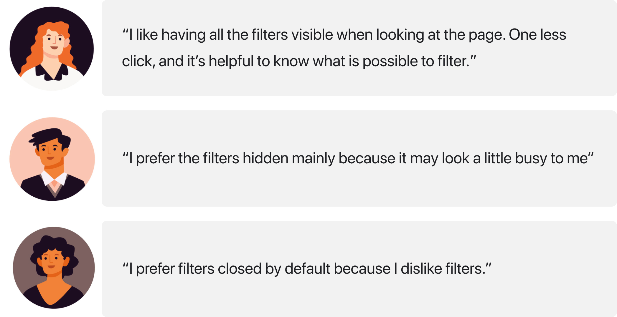
I responded to this user feedback by making a very simple structured search interface. All the search fields are in one line and they have rounded corners to soften the look. I think this solution retains most of the benefits of being open by default without taking up as much vertical space.
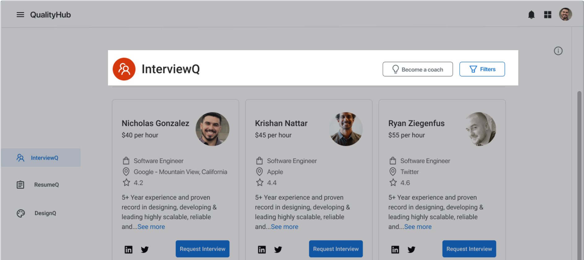
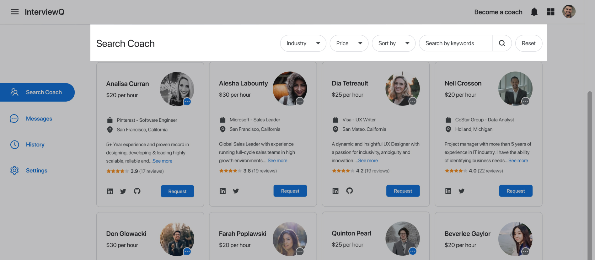
Final version
How might we make the coach card feel trustworthy?
In initial user research, I discovered that seekers need to have confidence that they will get a good return on their investment. I addressed this concern by incorporating several credibility indicators on coach cards.
Users see coach cards right away, so it was important to get them right.
I also included a “fun” feeling since some users mentioned that using this kind of service can be overwhelming and stressful.
Early iteration
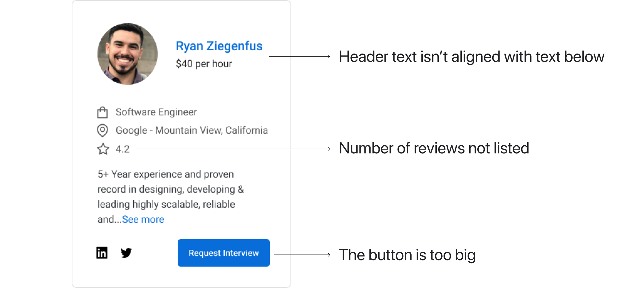
After asking people for feedback for this first version of coach card, I realized that there are some areas that I can improve on. The devs told me that the rating is hard to understand since the number of reviews are not listed.
I also got feedback that the card felt “flat” due to the amount of single-shaded grey icons and text.
Final version
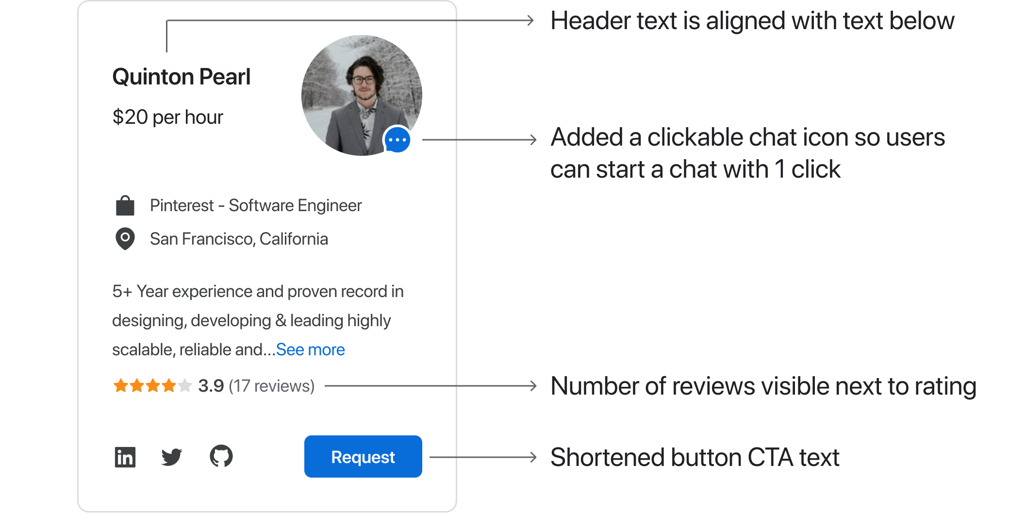
The final version incorporates the feedback I received on the early iteration, while maintaining the focus on solving user needs identified during initial research.
One thing I would like to highlight is the chat icon at the bottom right corner of the coach’s profile picture. I added this to more thoroughly address two user needs:
- Seekers need to believe the coach is trustworthy. Chatting with someone is a great way to build up rapport and trust quickly.
- Seekers can feel overwhelmed and stressed out during the job search. Knowing that they can chat with a real human makes the product feel more welcoming and appoachable.
What challenges did I face?
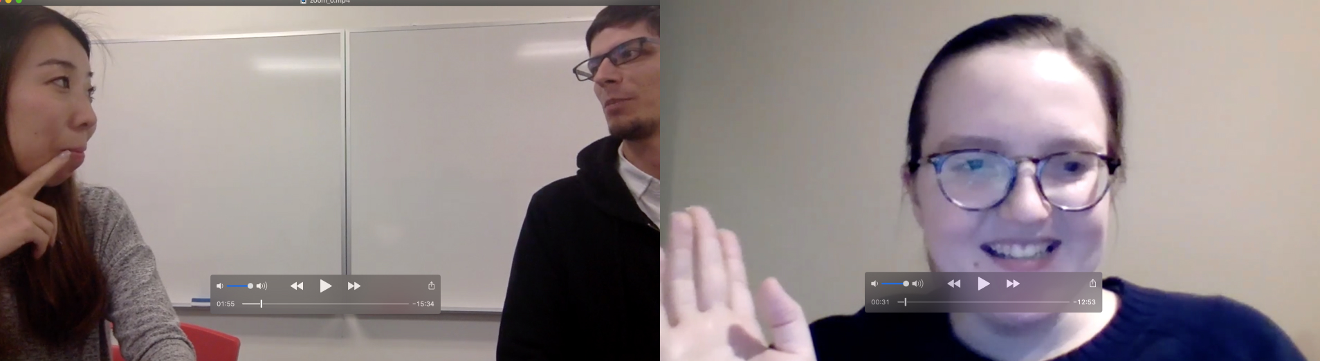
Designing coherent information architecture and user flows was the biggest challenge for me since QualityHub:InterviewQ has two target user personas (seekers and coaches). I rewrote the user flows on paper several times to organize my thoughts and make sure the flows meet the needs of both user types.
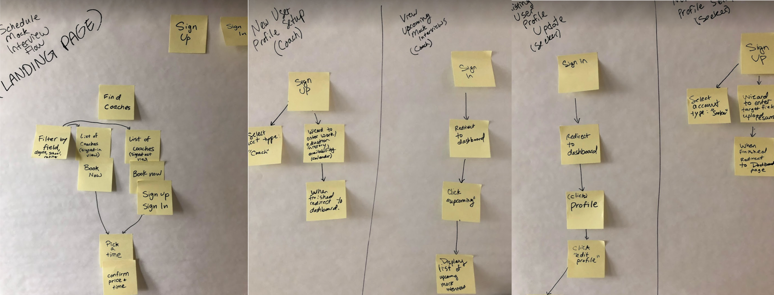
Stickynotes all over my wall!
Takeaways
- Iterate a lot and keep all the iterations. It’s important to try different design styles until the problem space has been thoroughly explored.
- Test everything for usability. Blindspots will be exposed and assumptions will be validated (or invalidated).
- While designing, keep implementation feasibility in mind. Constant communication with the developers helps here (even if it seems like a small thing).
- ENJOY the process with your team! Building relationships with your team creates good vibes and positivity.
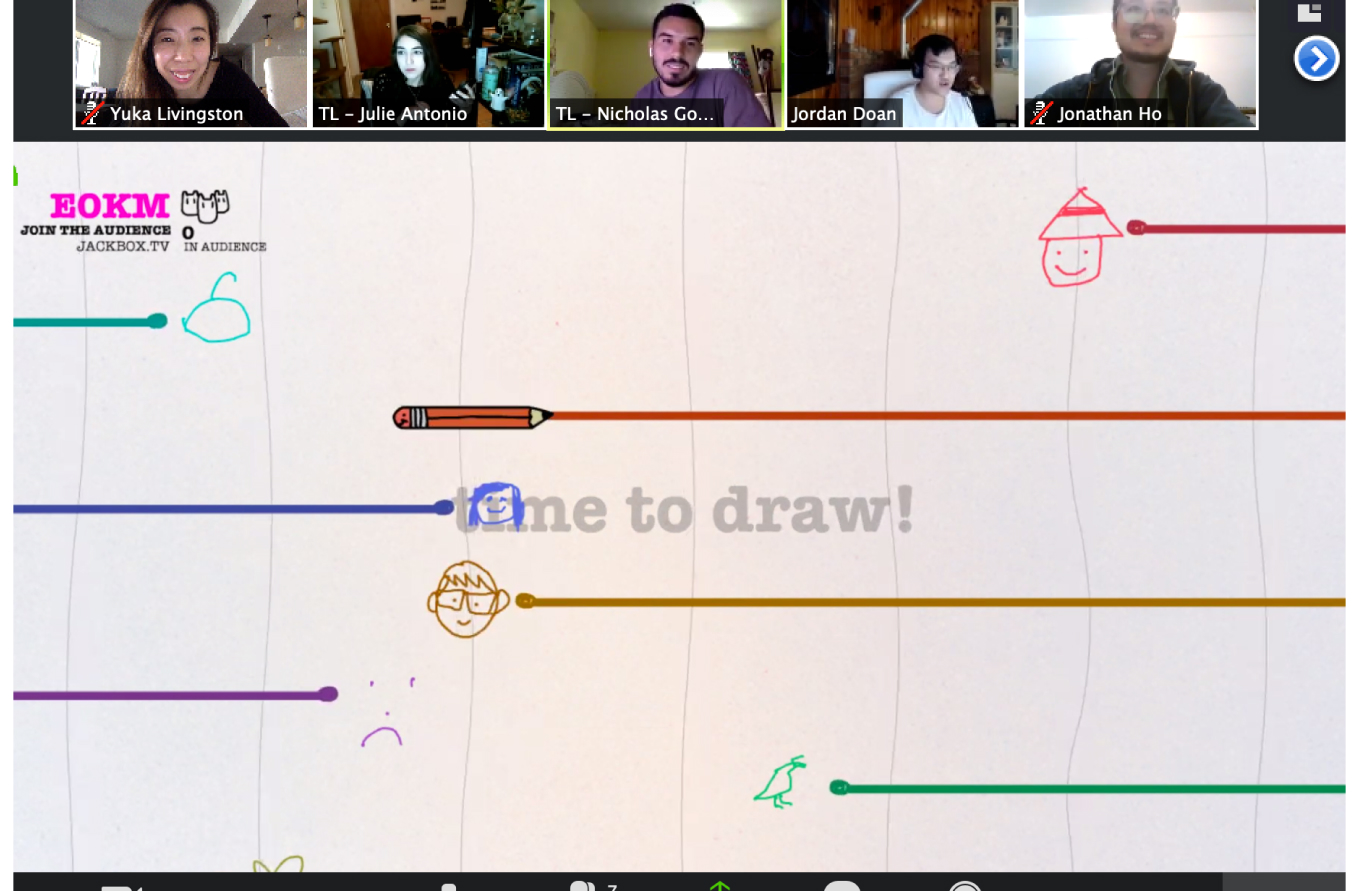
Sometimes we refreshed by playing games!
Next steps for QualityHub: InterviewQ
Improve the video call interface. I was unable to invest in usability tests for this flow and I think there are a lot of opportunities to make it better for users.
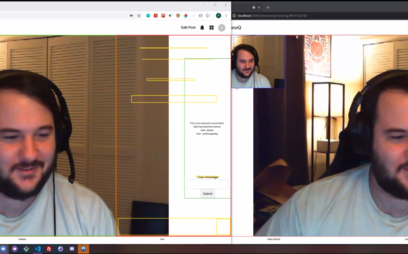
Discussed with the dev what kind of UX/UI the video call feature should have
What did we ship? Here are the final designs!
We were able to ship all the flows. The live website is not a pixel-perfect implementation of my design but it’s 90% the same. Our product was voted 1st place among 20 other products and our advice on how to successfully build products as a team was used to instruct future students.
Final Userflow: See More

Final Userflow: Filter

Final Userflow: Request Interview