What is ReadEasy?
It’s a Japanese language learning app that aims to be the best way for non-native Japanese speakers to read Japanese.
Getting to know the users
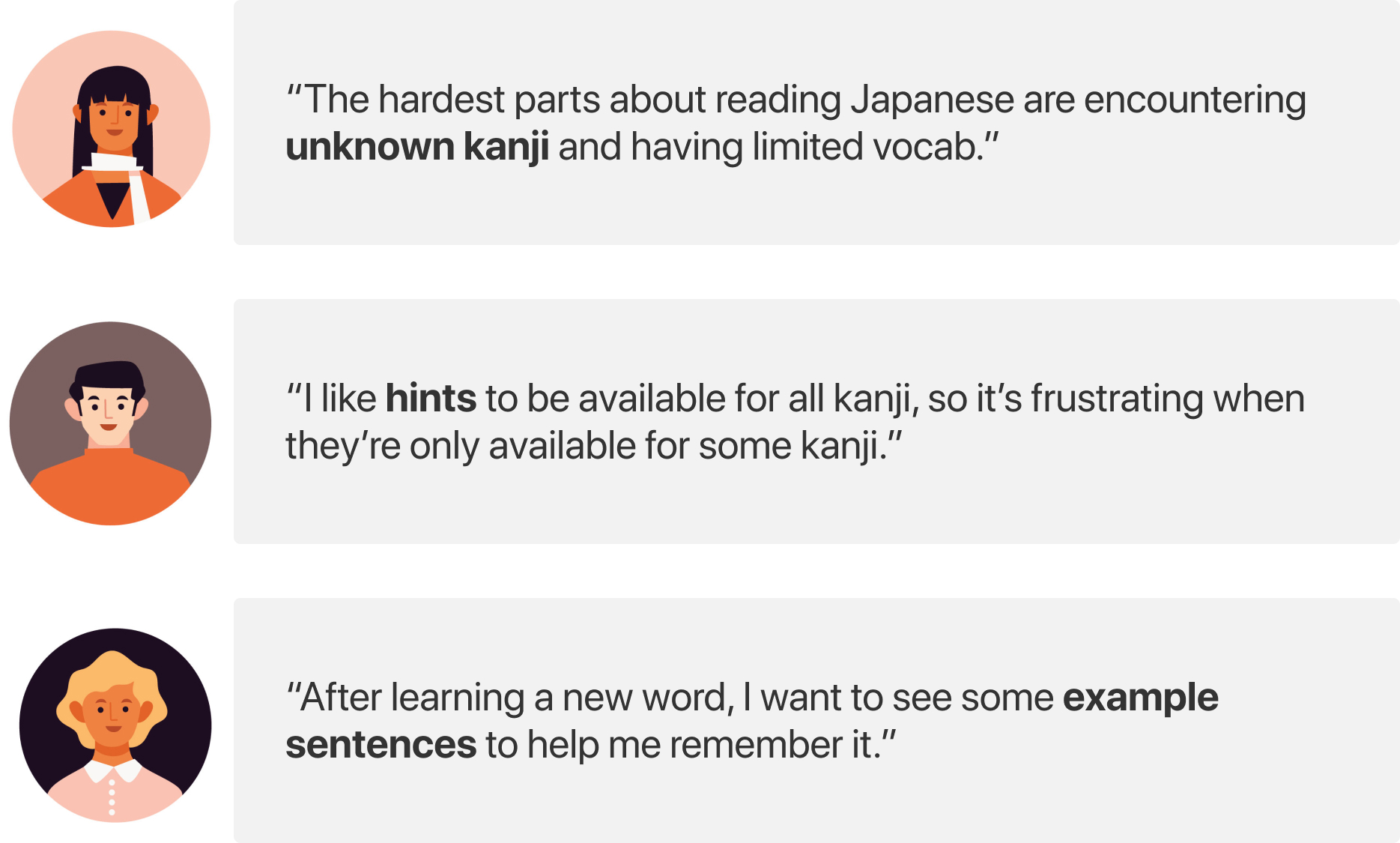
I conducted 5 user interviews with people who live and work in Japan to better understand their experience trying to get better at reading Japanese. None of them were native Japanese speakers.
They shared about their experiences using Japanese language learning apps and I was able to learn some of their biggest pain points.
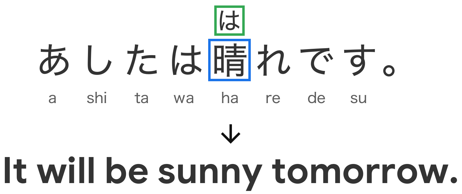
For simplicity, you can think of kanji as complex Chinese characters that require many strokes to write. For example, the character in the blue box is kanji and the character in the green box is a hint that makes the kanji readable for users.
I came away from the user interviews with 4 big insights. The product should:
- Make unknown kanji readable for users
- Provide English definitions of Japanese words and example sentences
- Support langauge learners with all levels of ability (beginner to advanced)
- Be mobile-first
A brief look at competitors
I wanted to take a look at how other apps solve the user pain points I identified. There are multiple apps devoted to helping people get better at reading Japanese. The table evaluates how well other apps solve user pain points.
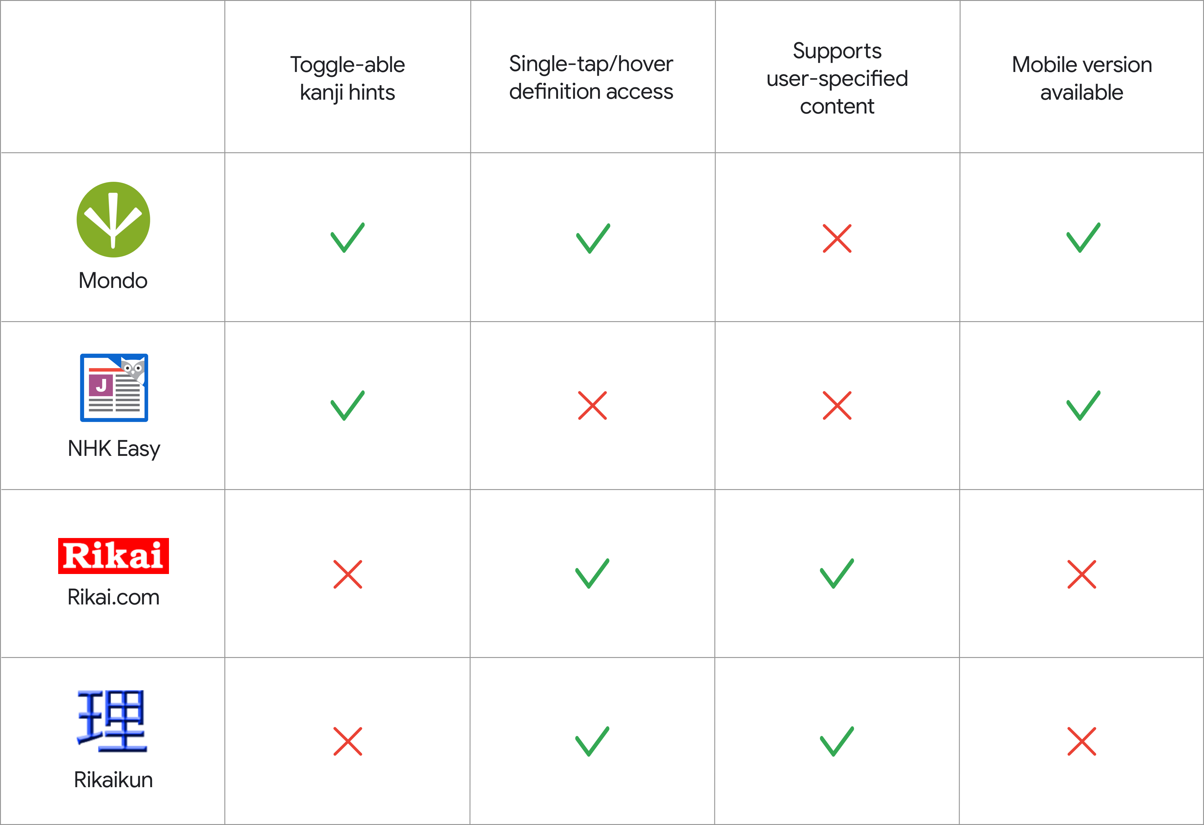
My competitor research revealed a gap in the market. None of the apps I evaluated solved all 4 pain points. I saw this as an opportunity to design a mobile app that meets users needs more effectively.
Mapping out user flows at a high level
I used a whiteboard to brainstorm a detailed sitemap to understand how users will flow through the app.
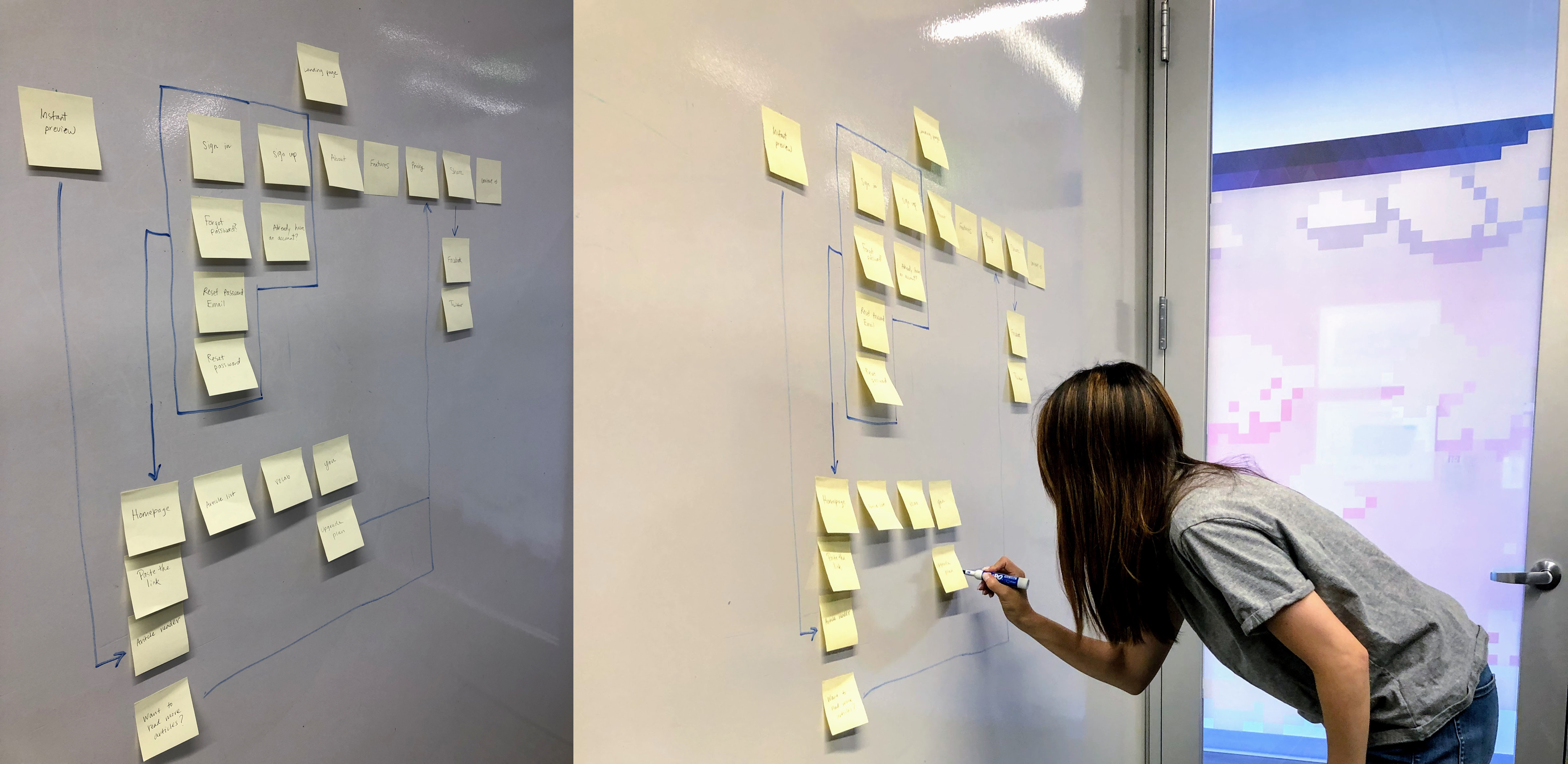
Whiteboarding a sitemap
To guide the whiteboarding session, I wrote 4 user scenarios that cover common task sequences that users will go through in ReadEasy. The user scenarios summarize how users will use the app.
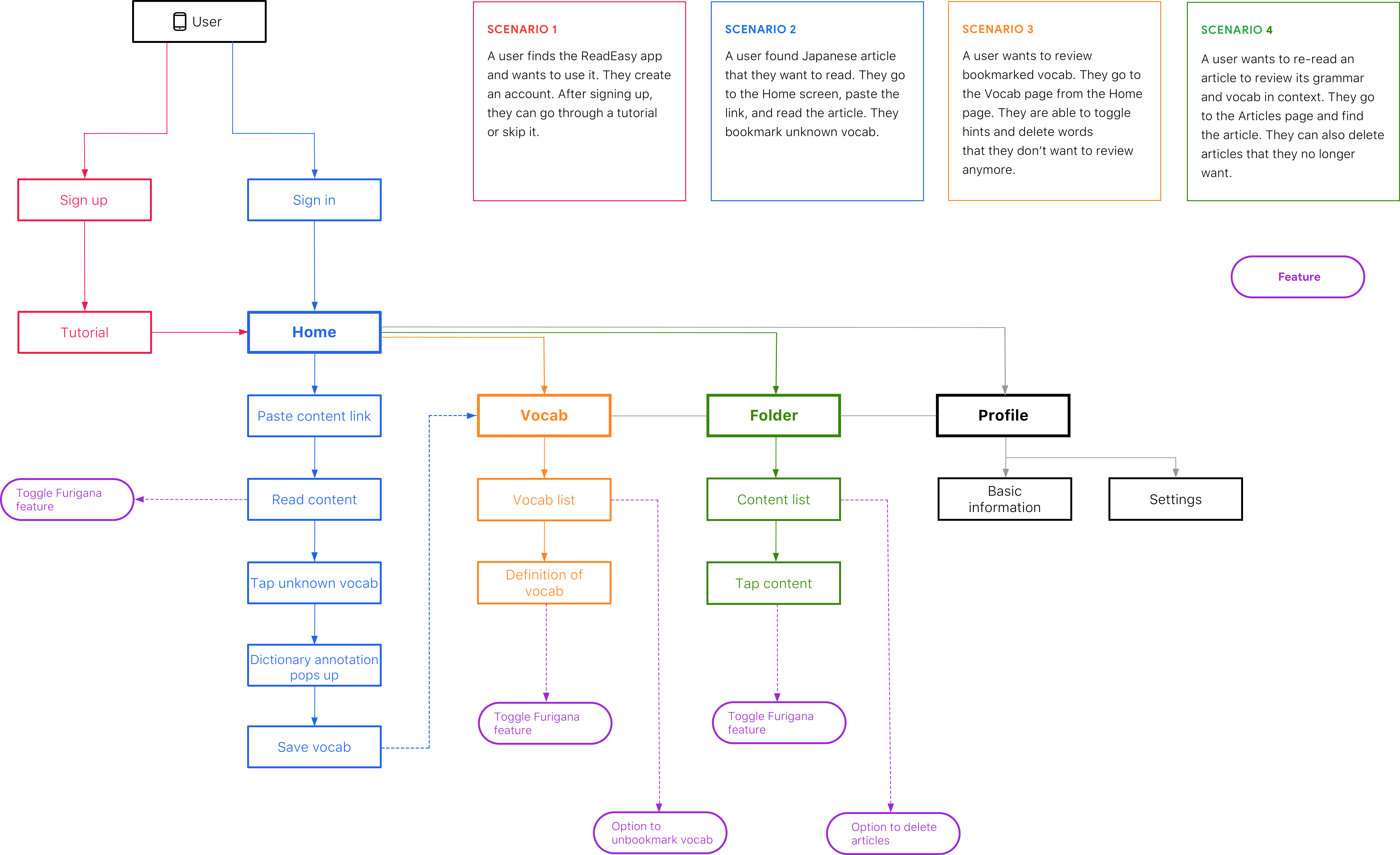
Bird's eye view of the app
Sketching out initial wireframes
I selected the sitemap screens most relevant to the 4 user pain points I identified and sketched out some rough wireframes for them. I used the crazy-8s method to generate several options for each page.
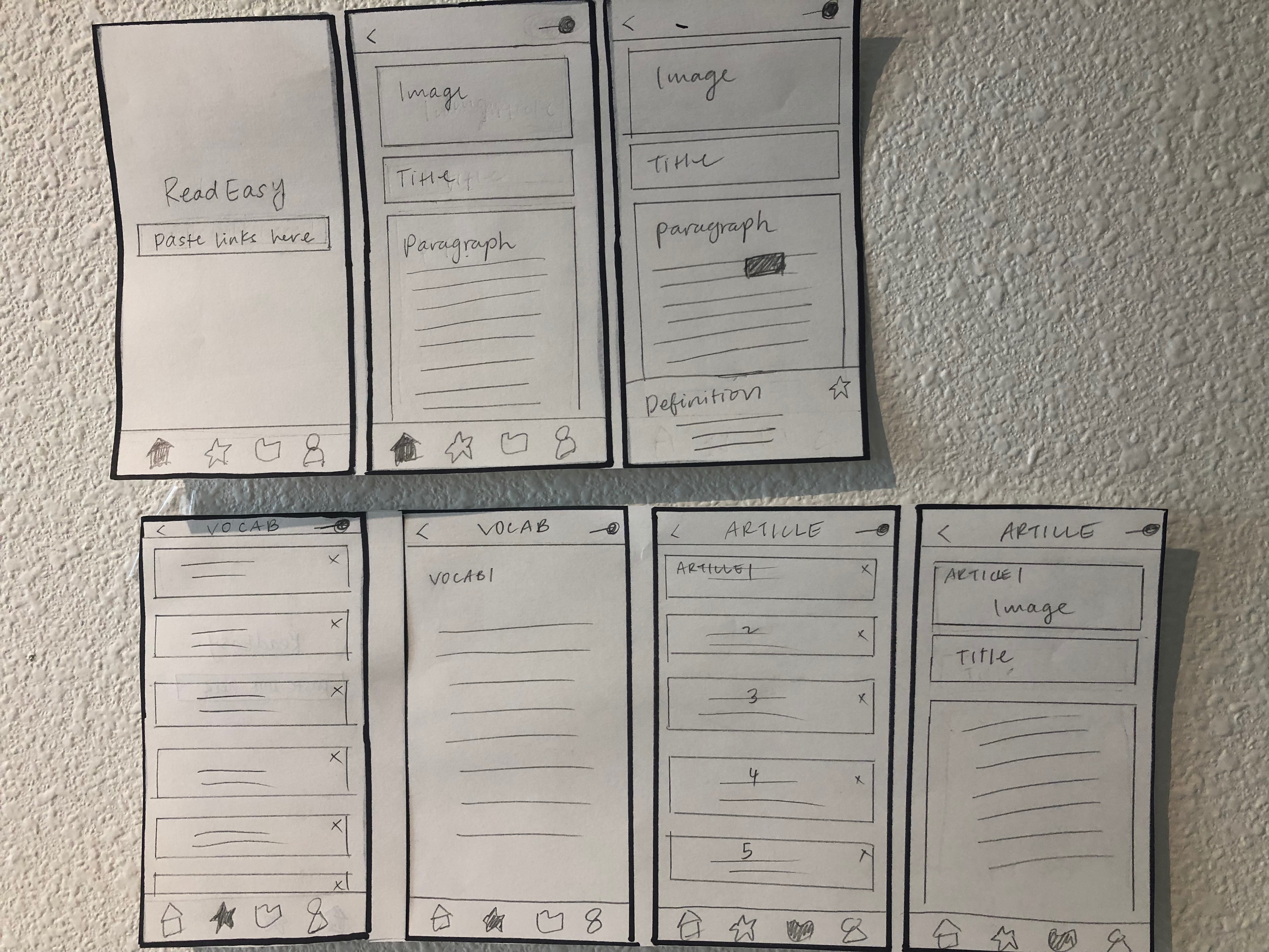
Early sketches
Optimizing hint toggle button placement
My first iteration of the article reader screen had the hint toggle button in the top right corner. When users tap this button, hints will appear above the kanji.
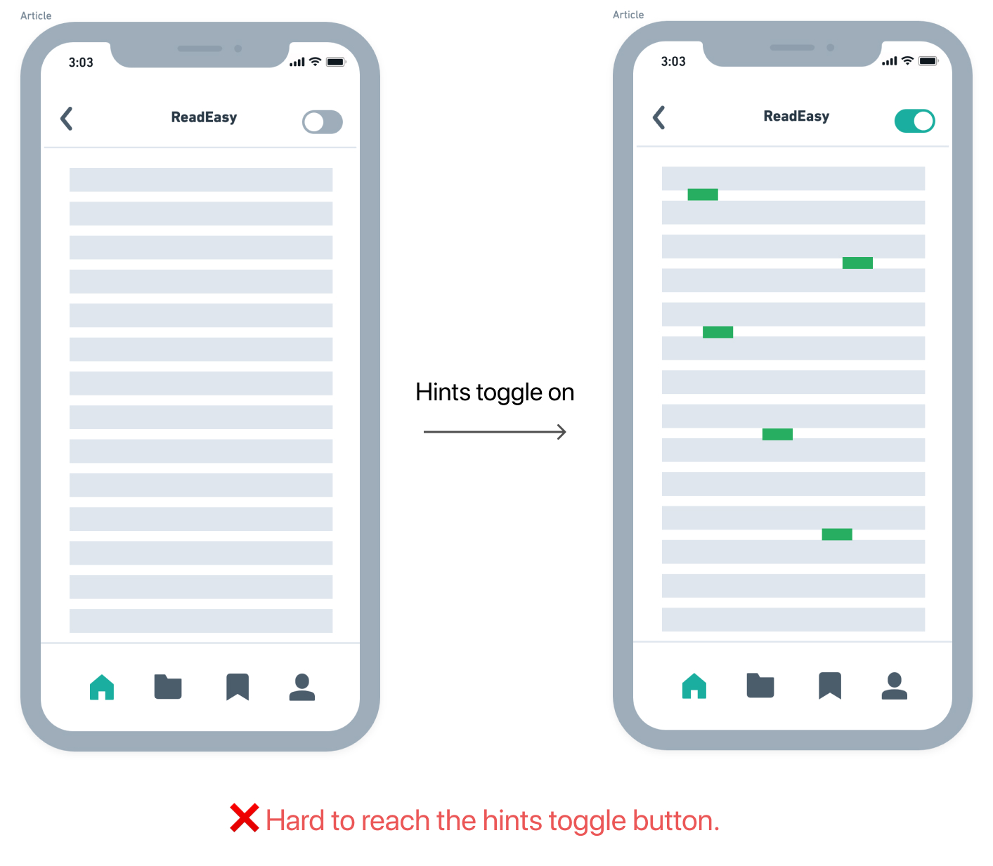
When I conducted usability tests, it became clear there was a problem with this button. It was placed way too high on the screen. Users had trouble reaching the button with their thumbs. This design flaw was made worse because users frequently need to tap this button. While I was doing usability tests, I observed users stretching their thumb to reach the button multiple times per article.
After some research, I found a thumb reachability map that confirmed this problem and helped me decide on the best solution.
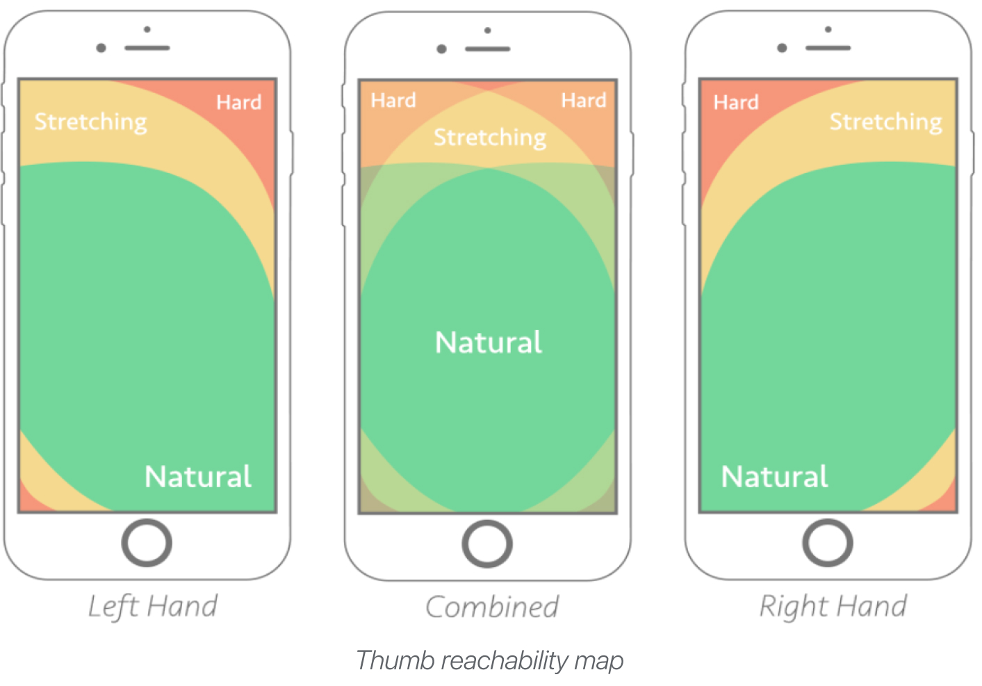
To solve this problem, I decided to put a floating hint toggle button in the bottom right. That way, users can tap it without stretching their thumbs.
This design decision increases the accessibility of the app, especially for users with shorter than average thumbs and large phone screens.
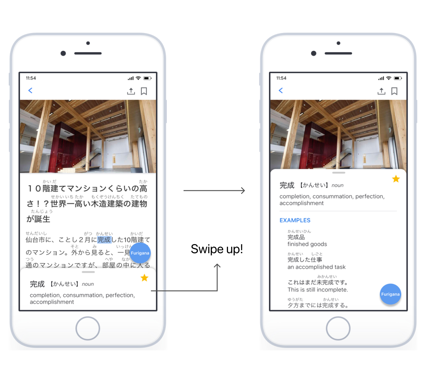
Experimenting with swipe up interactions
I added an interaction that allows users to tap on any word in an article and then the definition box will pop up at the bottom of the screen.
One of the insights I got during user interviews was that users want to see more than just the simple definition. They want to see the word used in example sentences to help them remember it better.
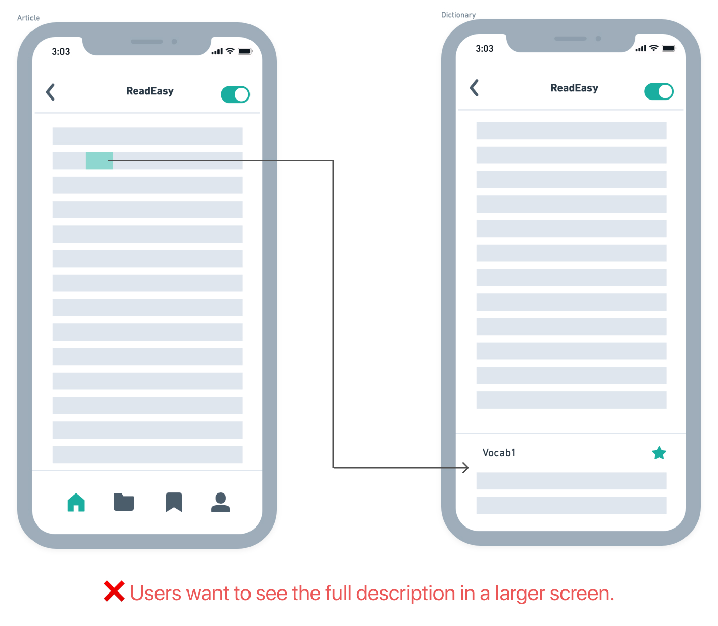
I tried making the initial definition box popup big enough to contain example sentences. That didn’t work out because example sentences require a lot more space than simple word definitions. The popup box was taking up more than half of the phone screen for most words.
To solve this problem, I created an swipe up interaction on the initial definition box that causes the box to expand and show example sentences.
Other design wins from usablity tests
The usability test insights I did a deep dive on above are only 2 of the things I learned from usability tests. The usability tests I performed produced several other insights as well.
Conducting usability test
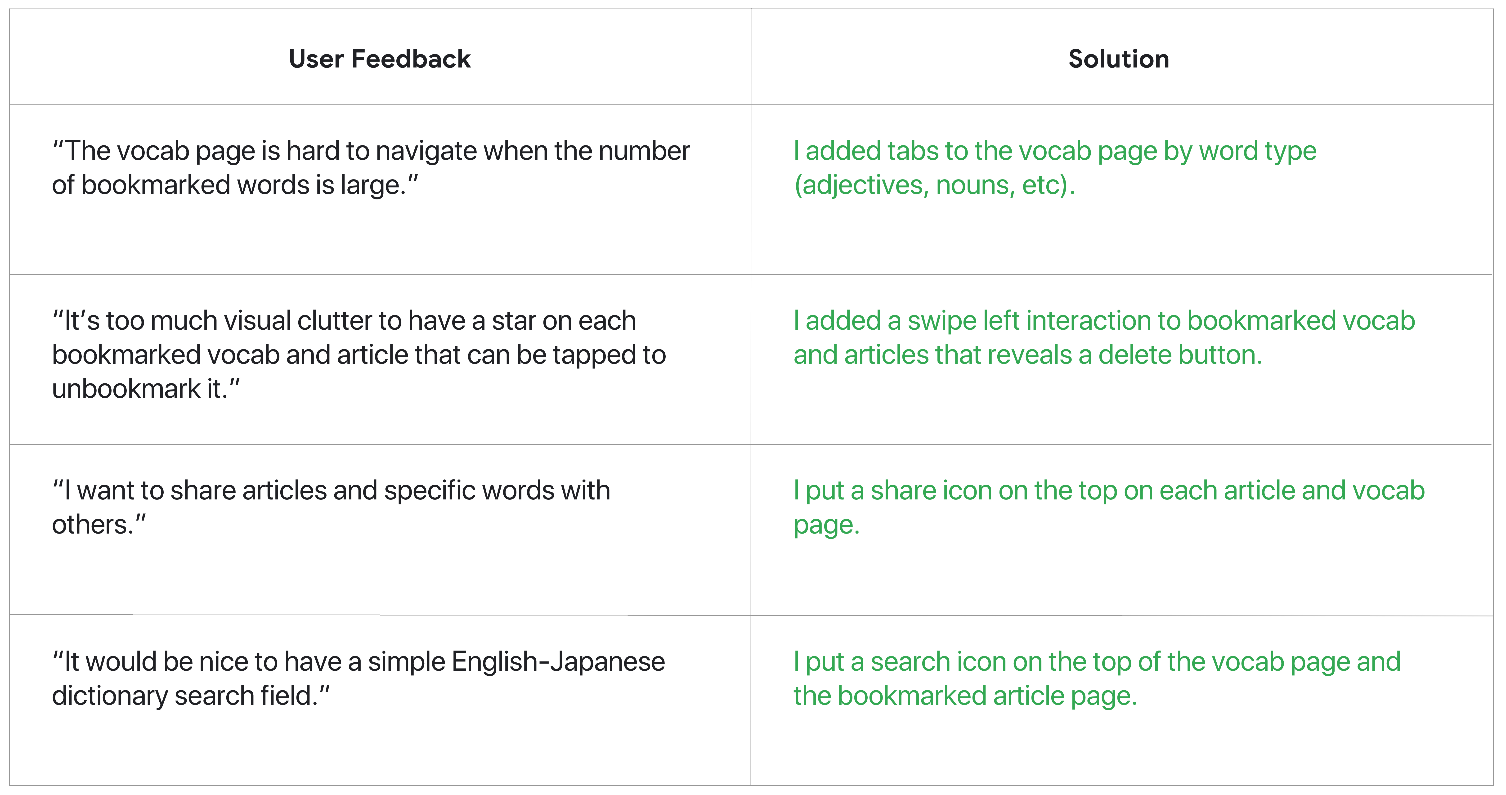
The table below shows additional examples of how I incorporated user feedback into my design.
What are the next steps for ReadEasy?
- Allow users to take notes and highlight sentences in the article. There was interest in note-taking and sentence highlighting during user interviews, but it was not the top priority.
- Explore designing a browser plugin that delivers the same value to users that the app delivers, but does not make users context switch between the content source and the ReadEasy app.
Here are the final designs!
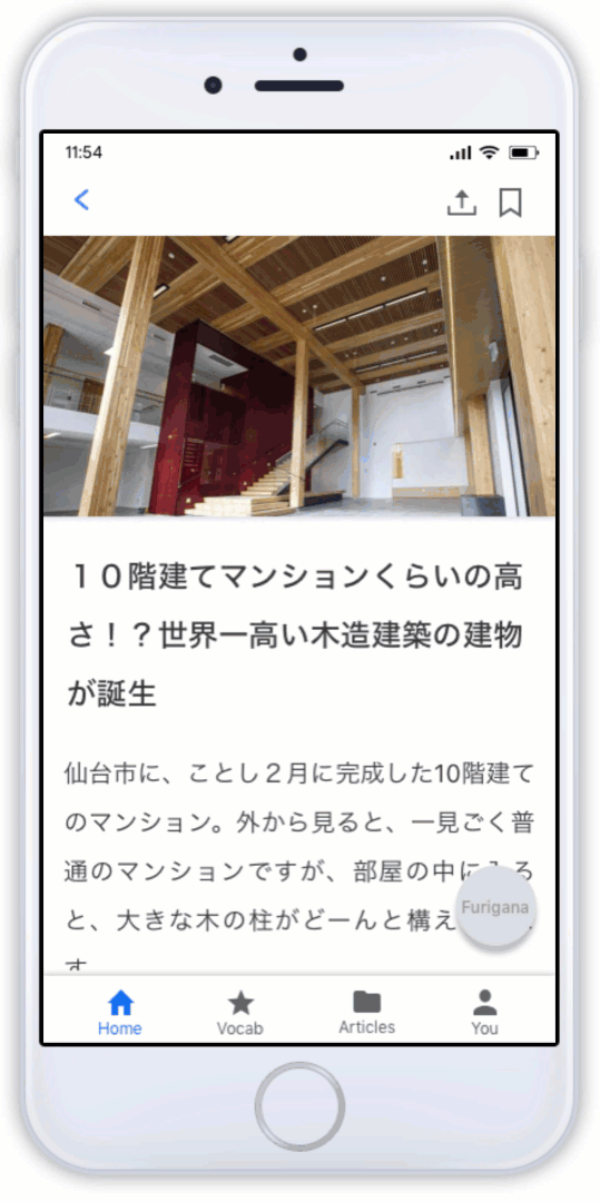
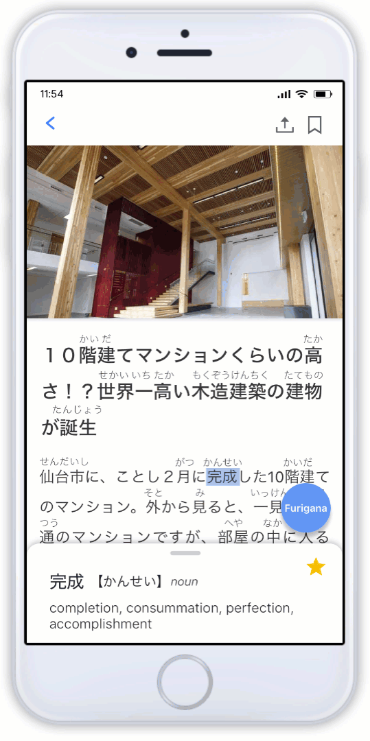
Hints and dictionary features
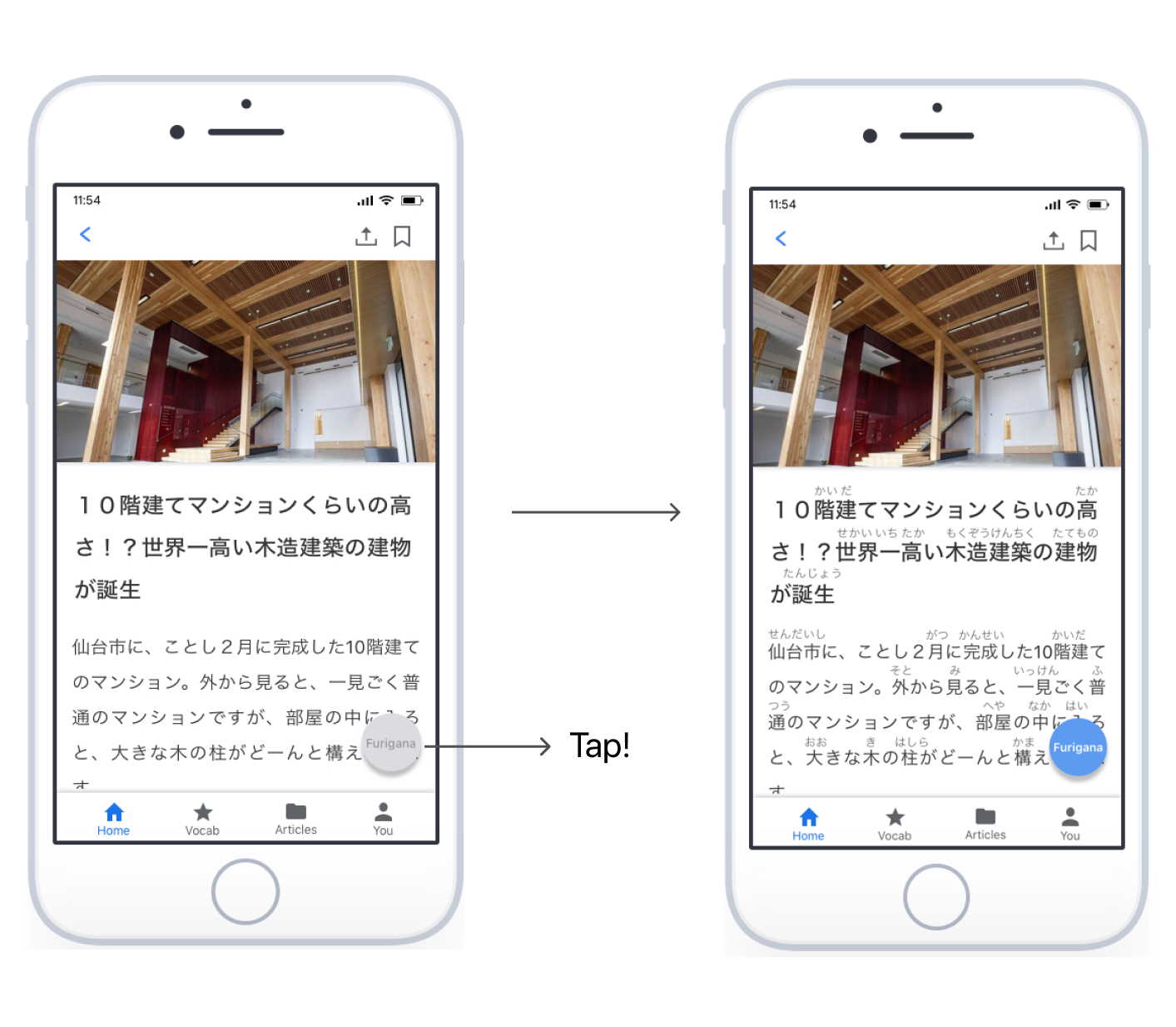
Just tap the hint toggle button and users can easily see hints for each kanji. Tap any word and its definition will pop up.
Bookmarked vocab and articles
The vocab or articles that you bookmark will be listed by category. Users can easily go back and find the ones they are looking for.